Exabeam Threat Center with AI Copilot
Summary: Exabeam, a leading enterprise SaaS provider in the field of User and Entity Behavior Analytics (UEBA), faced the critical challenge of transitioning from its existing on-premise UEBA solution to a cloud-native Security Information and Event Management (SIEM) and Threat Detection and Incident Response (TDIR) platform. As an individual contributor and manager I designed for and oversaw the completion of this new core product.
Role: Principal Product Designer & Manager
Tools: Competitive analysis, Figma, Figjam, Usertesting.com
Prototype: Exabeam Threat Center in Figma
Key Challenges
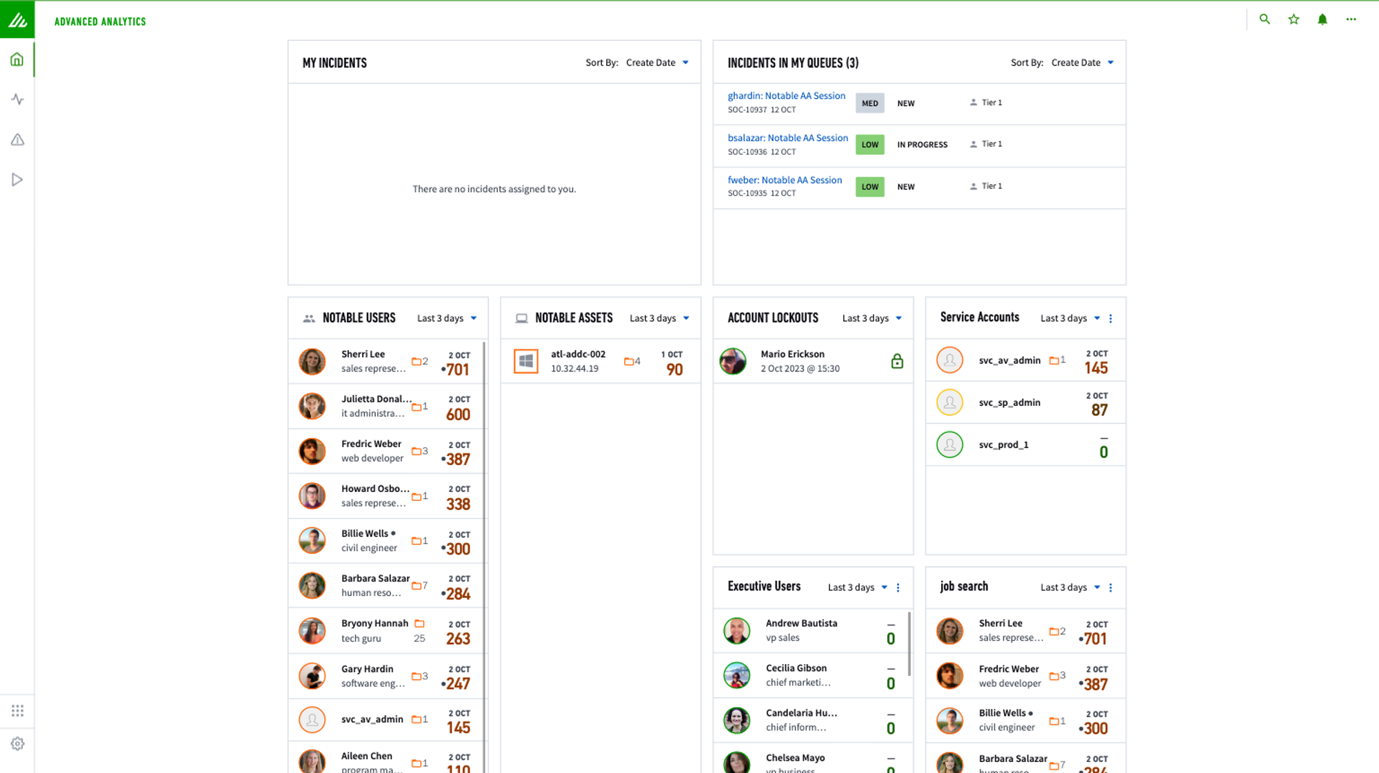
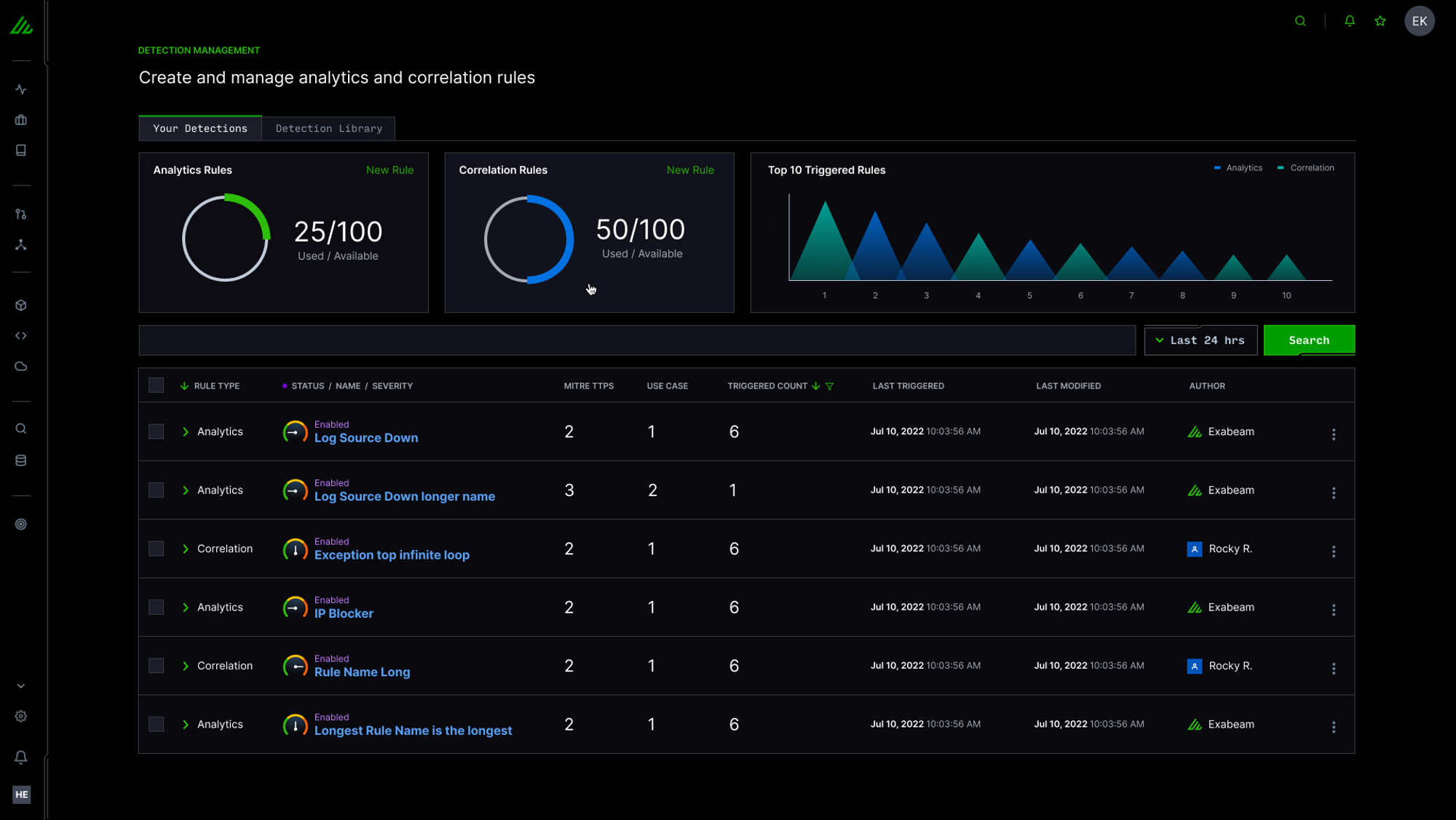
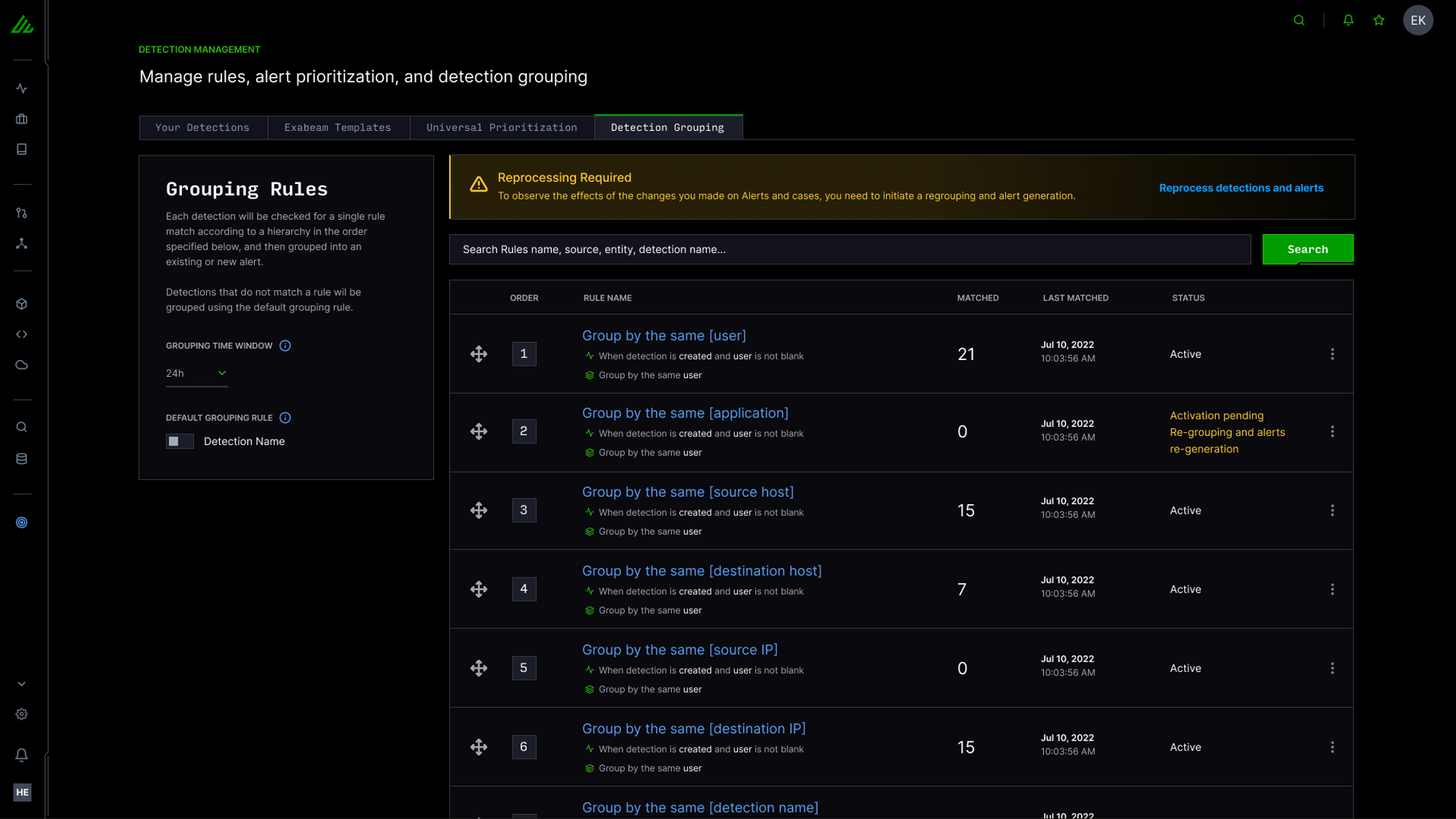
Tab Inception: The legacy platform provided a large amount of insightful information regarding user behavior but the data was spread across a handful of pages requiring an analyst to have numerous tabs open and click through them to get a clear picture of risk.
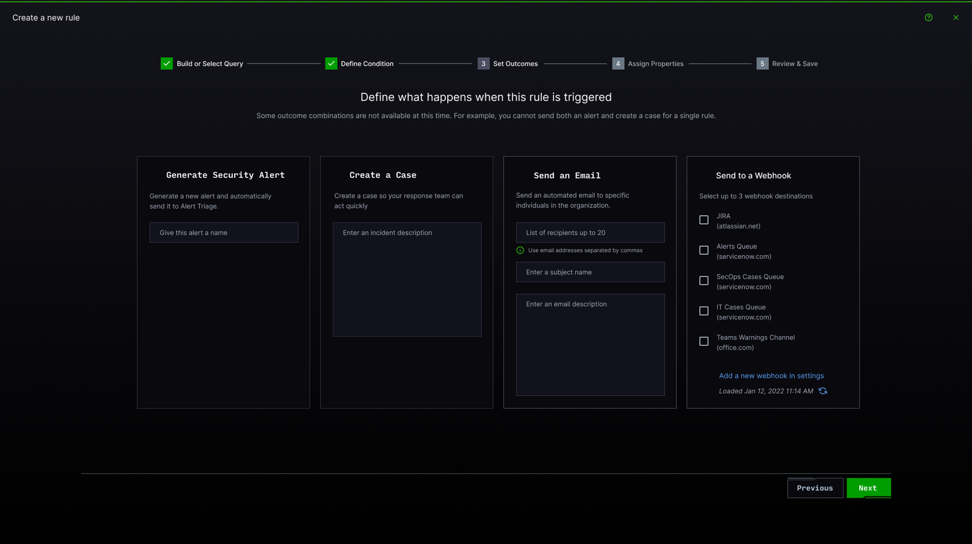
Broken Investigation Flow: Any response to an incident meant opening a separate application within the platform for triage and remediation. By the end of the process our analysts had browser windows filled with open tabs dedicated to investigating and triaging a single incident.
Suggested Improvements
We crafted a user flow around a persona based use case to identify where we could consolidate tasks and keep analysts in a single page while working through multiple tasks.
Consolidate investigation and remediation tasks into fewer pages.
increase efficiency and analyst productivity.
Add quality of life improvements to enable users to make faster decisions when looking at alerts.
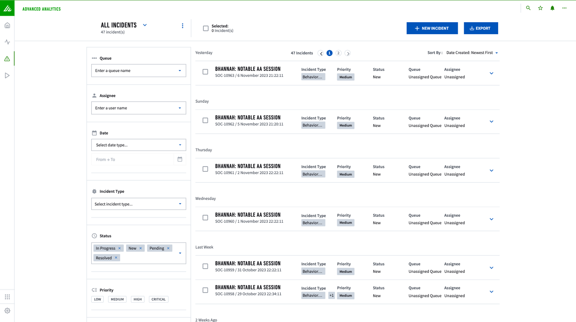
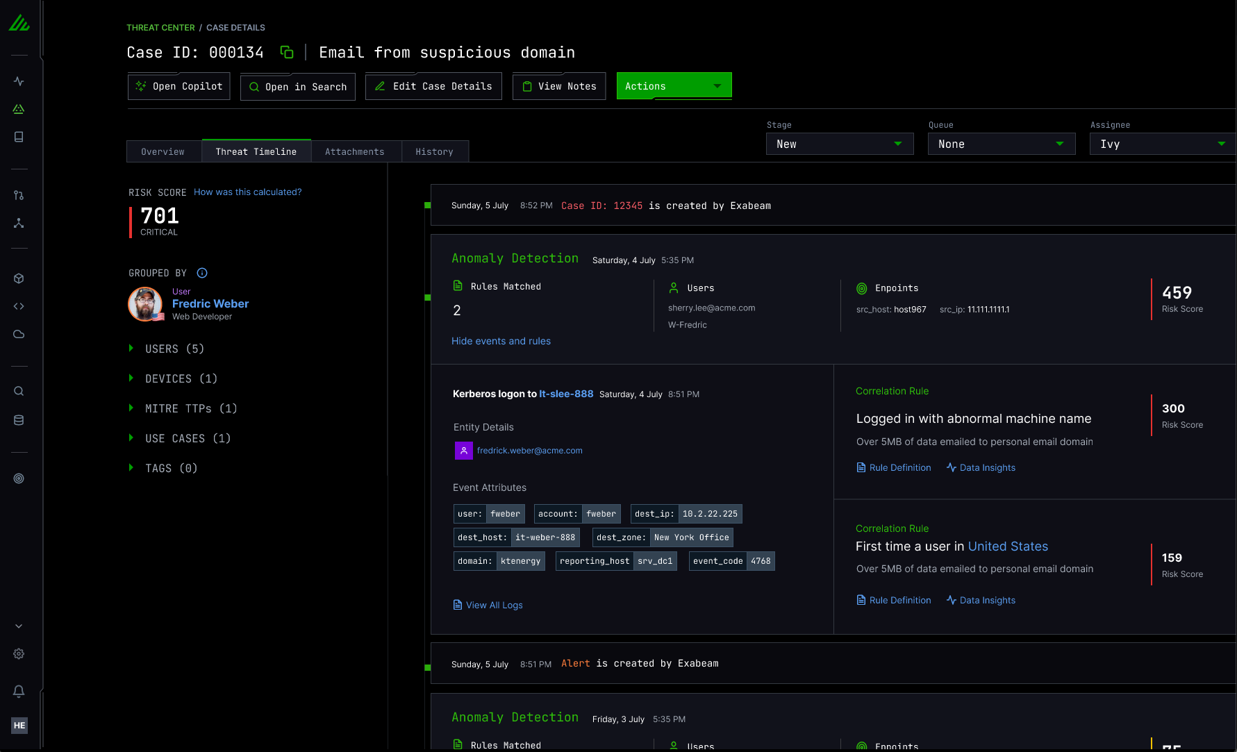
Our solution was to reorganize the information from the previous dashboard and list user alerts in a table view prioritized by risk. This allows analysts to quickly understand which alerts to investigate first.
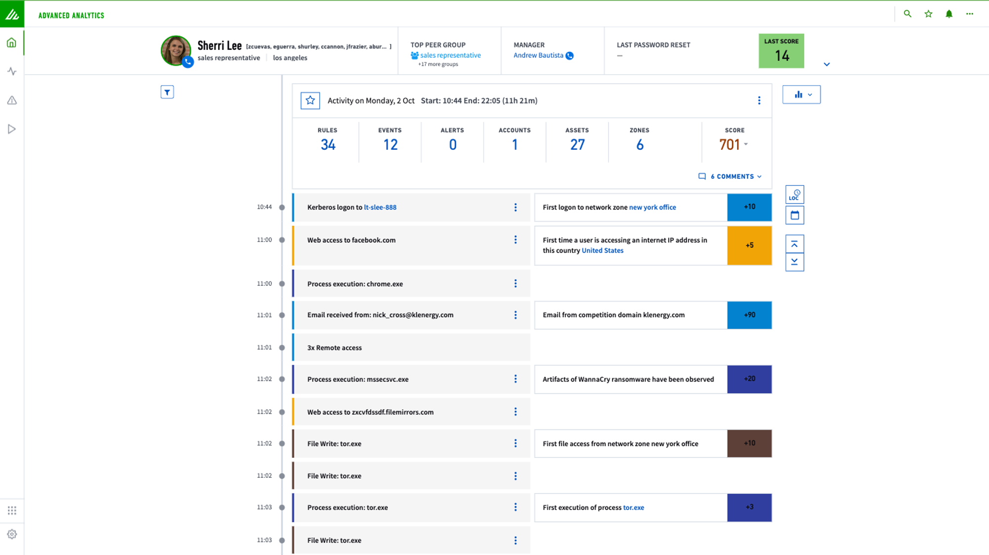
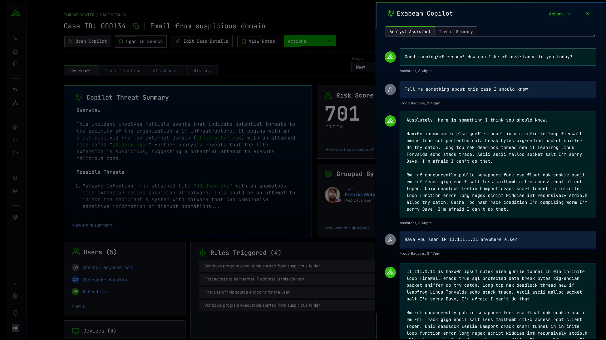
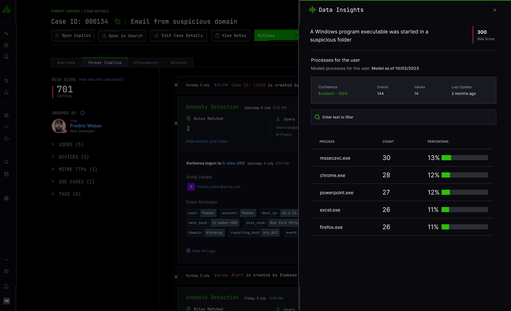
From there users can view a detail page that includes timelines, history, attachments, and all the event details in a single place rather than open a handful of browser tabs to view the same information.
Design Partner Feedback
Our partner sessions were extremely valuable. We received validation on our decision to move from a fragmented UX to a streamlined and consolidated list view. The new designs generated a great amount of excitement and relief in not having to open tabs for every task. In our testing sessions analysts were much more efficient when deciding which alerts to investigate and were pleasantly surprised to find all of the relevant data in a single timeline view.
One opportunity for improvement came from consistent feedback regarding the amount of information in the timeline. It was overwhelming to the more novice users and they struggled to know what to do after opening the page. We have plans to refine the amount of default information displayed by interviewing more design partners and identifying what we can cut.